ShopDreamUp AI ArtDreamUp
Deviation Actions


Comments2
Join the community to add your comment. Already a deviant? Log In
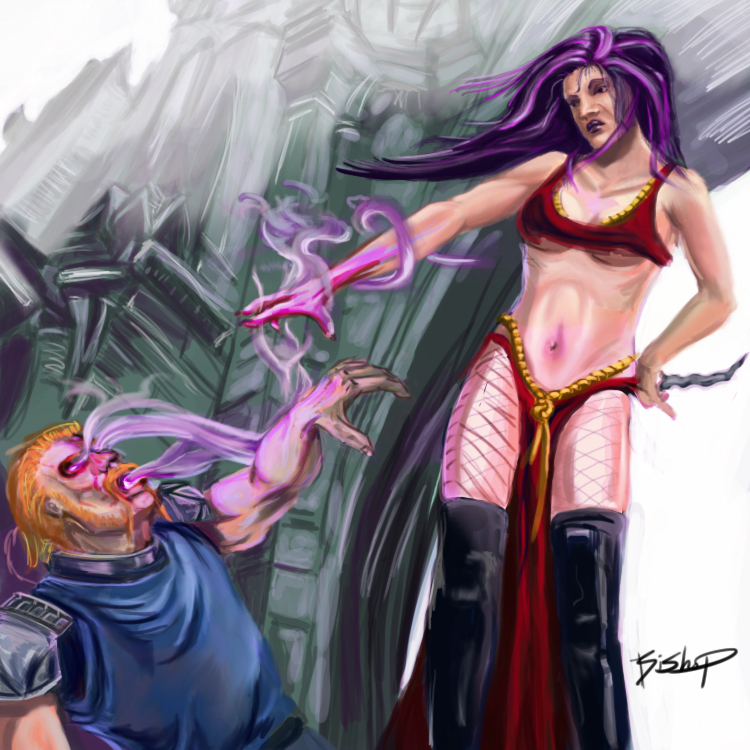
I waited to give you a critique because I wanted to give it some thought. I'll start with the things I think would make a large impact on your image and then I'll work down into the smaller picky junk that might help but won't make that big of a difference. The first thing I'll note is that your colors are very saturated (brilliant and vivid) which actually hurts you a bit because it causes them to blend in with your bright background and destroys your contrast. The focal point loses interest and causes the whole to be read as flat and destroys the depth. Some harder shadows (more grays being mixed into your elements (the sorceress and victim) will help you separate them from your bright background. Using the purple and pinks as a light source adds interest but the light needs to be more striking and contrasted to create line/edge and form your objects. So working on your contrast and pulling your foreground elements out would be a HUGE improvement. There are some anatomical issues going on but I think its because of the light being too blended and destroying your lines of contrast. That being said the womans abdomen area does need some more definition (I read her as pot-bellied instead of sexy). I do like that you are trying to incorporate some transparency in the skin where it becomes thinner to give your characters more realism but I think it needs more of a red hue instead of the pink. Another thing I really like is that you are trying for more of a dynamic perspective (from underneath) to create more drama in the scene. But doing that plays with your characters proportions if the lighting isn't right; I think thats why your blond guys arm reads short and stubby instead of bent at the elbow. The forearm should be casting a shadow on his bicep. If you fixed that I think it would place his arm properly. I also think your purple magic has a little too much form and kind of takes away from a misty fluid light look (Dropping your opacity and changing your brush to airbrush w/ the soft edges would help give it a more ghostly effect). Your chicks nose is a little wide and her lips being so puckered hurts her "prettiness". So if you made her nose more upturned and dainty it would help her overall sex appeal. *Her neck is a bit wide too. I'll take some notes in photoshop and send them to you via fb.